We are about to delve into a topic that is highly dependent on your requirements. Take a moment to understand and reflect on the current status of your website and where you want to take it to. Focus on what your site offers and who your target market is. Try to understand what the needs of your various users would be before continuing.
The increased use of cellular and portable devices has made your website-related goals quite clear and apparent. Basically, if you’ve not thought about website designs for mobile devices, then you should give it a thought straight away.
First, here are the reasons why this topic is important:
- Mobile device users form the major part of the internet-viewing audience
- The differences in screen-sizes are reducing rapidly. Almost every size is available.
- It is not enough to have a single inflexible website.
- Desire for speed makes everyone impatient. Every second counts.
- To develop and grow further, you will have to change your style of site management.
There are 2 site design options, namely Responsive Web Design (RWD) and Adaptive Web Design (AWD) which help us combat all the reasons listed above.
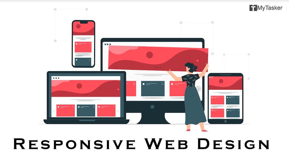
Responsive Web Design (RWD)
Since there isn’t just one size of mobile screen in the market, just one separate website will not be sufficient.
The fast-closing gap between screen sizes has caused the birth of the Responsive Web Design; a design that actively reacts and responds to different screen sizes.
This design causes the web pages to behave very much alike fluids, i.e., to take the shape of whatever screen it is ‘poured’ into. Key features of a RWD are:
- It is highly flexible.
- It has a higher loading time.
- Not required for low-content or less-intensive websites.
- It takes time and resources to be built.
- Same site experience for all users.
This was a revolutionary idea for intensive-use websites and high volume web pages. The idea of the site automatically adjusting itself proportionately to the various screen sizes was welcomed majorly by blogs and companies.
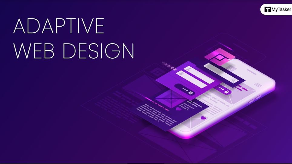
Adaptive Web Design (AWD)
The major limitation of RWD was that it completely ignored a majority of people with less resources and low volume of data on their websites; while they were the ones having an urgent need of ranking high.
An alternate design was required to include these sites while costing minimal sources.
Thus came the Adaptive Web Design. The web designer designs several (usually 3-4) different sized version of the site. Upon request for access by a mobile device, all the versions are loaded, and the one closest to the screen size is displayed.
Each version had resized images and in some the ads were completely blocked along with several plug-ins.
The workings of this design are quite simple:
1. Depending upon the wishes of the owner or designer, a finite number (3 or 4) versions of the Website are made with different base sizes.
2. When the user tries to access the website, it receives information regarding the viewing device’s size.
3. The website chooses the closest size of design among the ones predesigned, which then gets displayed.
Key features of AWD are:
- Low Flexibility
- Less load time
- Gives freedom to create different versions of site.
- Suitable for new and low volume websites
- Different site experience for different versions
Difference between Responsive and Adaptive Web Designs:

The features mentioned above for each can most sufficiently answer this question.
However, to make it more apparent, a fair idea can be grasped from this table, which highlights the difference between responsive and adaptive web design.
| Parameters | Responsive | Adaptive |
| Best Suited For | High Volume Websites | New Sites with less Data |
| Requirements | Knowledge of CSS code | Idea of different sized devices’ specs. |
| Flexibility | High | Low |
| Freedom | Comparatively Lower | Comparatively Higher |
| Site Experience | Same for all | Different for each version |
The parameters in the table above are explained below:
Best suited for:
RWD suits high volume sites where there is a large amount of data that needs to be loaded. Making multiple versions of heavy sites will be tedious, time consuming and will further slow down the load time.
AWD suits when you have small pages to load and making various versions won’t affect speed much. If your site is new, don’t waste resources and time with RWD. AWD is the better option.
Requirements:
RWD requires the understanding of a site’s CSS code and the ability to tweak it.
AWD just needs a web designer who can keep design volume low for fast loading.
Flexibility:
RWD has great flexibility, where just one design can suit all screen sizes. It responds, flexes, and fits.
AWD has minimum flexibility, since one design will work only for a particular range of sizes.
Furthermore, any change to the site can be made once in RWD but needs to be made multiple times for the different version in the case of AWD.
Freedom:
Since there is only once site to be made in RWD, the options are limited. This results in lesser freedom to try out site designs and ideas because one shot is all you get.
AWD on the other hand, lets you design different versions with different sizes and multiple options. You can execute designs at will while keeping the size specs in mind. AWD is a designer’s dream.
Site Experience:
It is the same website in all cases when the RWD is applied. Hence, no matter what size or device the webpages are being viewed on, the experience will be the same.
Whereas in AWD, the different versions of sites, each with separate functions and characteristics, provide a different user experience each time the size is changed.
So which is better, Responsive or Adaptive Web Design?
There is no one right answer. It all matters what your aspirations, ambitions and requirements are. Mostly, what you feel and understand your users’ requirements to be.
The basics are however very simple; if you have a high volume website, and feel that users need to see most of it no matter where they access it from, go for Responsive.
If you’re just starting out with your site, and want to get in the lead by being visible on the mobile front, go for Adaptive.
For those of you who are in the middle; with a medium volume of sites and enough time and expertise to invest, it really depends on what you plan to present to the public.
Picture-intensive? Text-intensive? Speed preference over quality? It’s YOUR call.
The information above will guide and help you realize which direction you should proceed in.
Conclusion:
In the war between Responsive and Adaptive designs, there are no losers. There are just purely objective comparisons.
In the end, what matters is what you need. And what you need matters on what you have. We have discussed sufficiently on what needs to be done henceforth.
However, one piece of advice: Almost every person who first hears of this concept, immediately panics. They fear missing out on what seems to be a wonderful idea.
Don’t rush.
It is more important to understand your website and its purpose, before jumping to design plans.
Your ‘Needs v/s Plans’ must be sorted before you argue over ‘Responsive v/s Adaptive.’
First decide who you want to build the house for, and then design the blueprints. Don’t build them and then break your head. Make a decision and stick to it.


.jpg)

_.jpg)